
Progressive e-learning design revolves around users and their lives. Sylvia Vorhauser-Smith writes in a Forbes article that the future of e-learning platforms will be making learning “easier to find, more engaging to digest and accessible on-demand.” So how does progressive e-learning design fit into all of this?
It’s long past time that students only had access to the family PC for lessons. Today, 70% of e-learners use their smartphones. And, as we’ll see, progressive design adapts content to suit the device, which is crucial for those who learn on their phones or tablets.
HTML5 is the golden ticket that allows e-learning developers to create online solutions that can automatically morph content to suit varying screen sizes. The crucial part here is to not only adapt the size of content but also make it easily digestible. Shrinking content from desktop to mobile devices isn’t enough; the writing becomes all but illegible and frustrates the user.
Progressive design positions content in a way that delivers a delightful experience to the user.
There’s a lot you can also do with progressive design. Many e-learning frameworks, such as Adapt, have a tagging function, which allows you to choose the content that is “hidden” depending on the device used. Tagging prevents interface cluttering and gives a smooth on-the-go learning experience.
When progressive design is executed well, learners will feel that the course fits well into their lives. And those low completion rates that most e-learning businesses endure will improve.
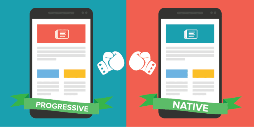
Progressive Design vs. Apps
E-learning website platforms have the edge on apps. There is a backlash on apps, as people are frustrated with the memory that these take up on their phone. Storage that they’d much rather give to their Spotify playlists. According to comScore, 66% of Americans download on average zero apps per month. This issue makes selling e-learning apps a tough sell.
You may have heard of responsive design within e-learning, which was the new kid on the block a few years ago. Progressive design is much more fluid. Grids and images are much more flexible and need less direction on where to be positioned.
Although technology advances are made every other week and leading edge companies will jump at folding these into their branding and services, the majority of companies will adopt only when Google announces that it’s time. In 2015, Mobilegeddon emerged, giving companies the ultimatum to create mobile-friendly websites or risk falling down the ranks. Responsive design, across all industries, then became the norm.
Fast forward to 2017 and Google have announced the AMP (Accelerated Mobile Platforms), an initiative that declares that sites now need to load instantly and be even better adapted for mobile devices.
Another area that drives responsive learning ahead as the more favorable option is its agile properties.
Think about it, creating a platform of any sort is not a smooth sail, there are going to be continuous tweaks as real users give feedback. Updating a web-based site is much simpler than doing so on an app. And not just for the L&D team. Users often ignore updates, so mistakes may not even be fixed giving your clients a substandard service.
It’s been a steep learning curve but what’s become glaringly obvious is that users do not want fancy, highly interactive websites on their smartphones. They are more interested in obtaining digestible content, like having a magnifying glass on the essence of the class.
Now that we’ve circled the parameters of progressive e-learning design, it’s time to explore a crucial area that is disrupting the industry – PWA.
Progressive Web Apps
Although Google announced this wave in 2015, it’s only now that we can see the rollout of PWA’s (progressive web apps). This is an impressive example of progressive design in action.
As you know, apps are built for optimized mobile-based interaction but placing these capabilities on the web prevents the storage barrier of a native app. It also means that, as in the case of a website, the updates are straightforward and have the advantage of being discoverable through Google.
Alex Russell, a senior software engineer at Google, defines PWAs as “responsive, connectivity-independent, app-like, fresh, safe, discoverable, re-engageable, re-installable, linkable web experiences.” And although it’s quite a mouthful, he really captures the areas where PWA has taken the lead of its predecessors.
So how do PWAs work?
PWAs are websites that perform like apps. They can function offline and can be shared via URL links.
The fact that they operate through HTTPS makes them safe. Your PWA’s functionalities rely on the manifest, which is a JavaScript file. This is what’s cached in users’ phones, and makes loading times quick once they re-enter your learning platform.
A current drawback of PWA is Safari’s inability to support for Push API or web app manifests. As you can guess, this limits functionality.
How PWAs slot into your student’s life
Companies have worked through a few pitfalls that would spell the premature demise of PWA. First, there is re-engagement. A frequent scenario within e-learning is the spontaneous decision people take to become students. One day they choose to pick up a language and immediately sign up with a free trial. After their afternoon of good intentions, they forget or lose motivation.
PWAs have push notification functionalities and also appear on students’ home screens, which gives your platform a better chance of surviving initial consumer reluctance. You need your platform to become a habit, and PWAs is an extremely enticing method of user-oriented design.
Your student should also be able to explore your platform without a second thought. The 2017 Digital Future Report findings show that the average American spends 24 hours a week online; so it’s safe to say they know their way around an app or website. If they find themselves confused or frustrated in proceeding to the next section or retaking a quiz, then they won’t be blaming themselves.
So although, PWA’s impressive, they don’t make the initial design decisions any easier. It is only in the final stages where you will see the remarkable layout decisions that make this progressive design enhancer shine through.
On a final note
Progressive design isn’t widespread yet in the e-learning industry, so if you’re looking to getting a more substantial market share, changing your format is an excellent option. E-learning platforms need to be bold and disruptive, to provide a unique yet effective digital classroom, and PWA offers these potentials.