Microsoft on Wednesday announced that it is planning to change the default Microsoft Office font, Calibri, and make way for new default font.
For those unaware, Calibri was released to the general public in 2007 with Microsoft Office 2007 and Windows Vista.
In Office 2007, it replaced Times New Roman as the default typeface in Word and replaced Arial as the default in PowerPoint, Excel, Outlook, and WordPad, and has since been the default font for Microsoft products.
“A default font is often the first impression we make; it’s the visual identity we present to other people via our resumes, documents, or emails.
And just as people and the world around us age and grow, so too should our modes of expression,” the Microsoft Design team wrote in a blog post on Wednesday.
“Calibri has been the default font for all things Microsoft since 2007, when it stepped in to replace Times New Roman across Microsoft Office. It has served us all well, but we believe it’s time to evolve.”
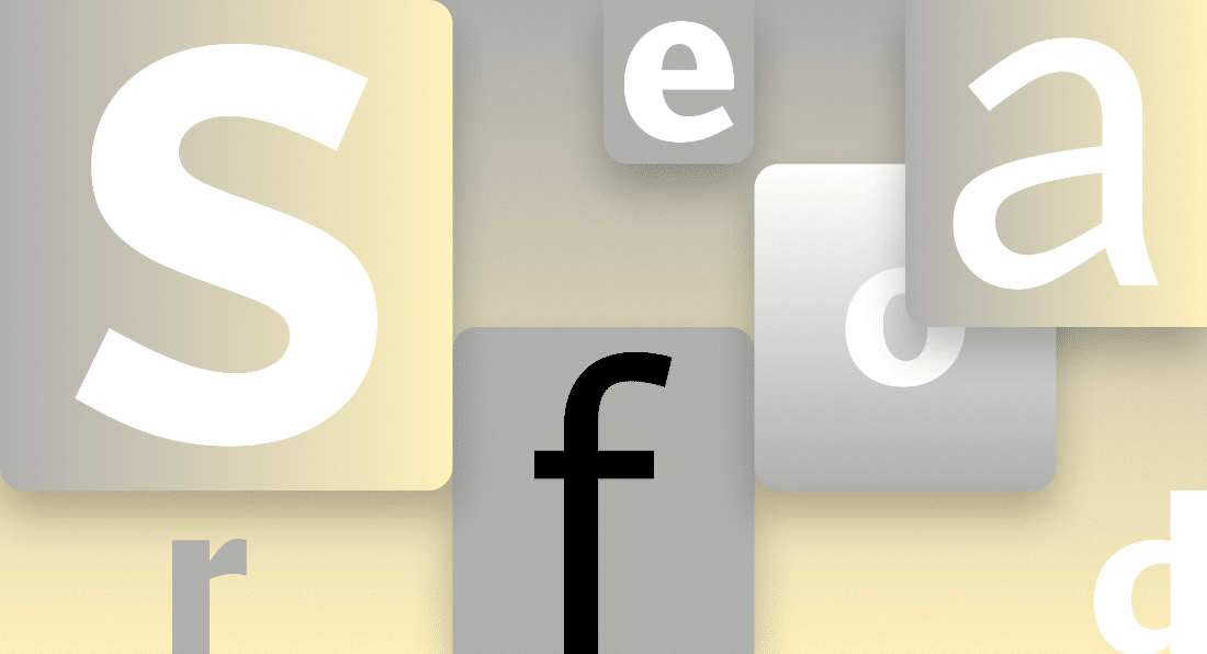
The team also announced that it has commissioned five original, custom fonts to replace Calibri as the default across Office apps, Microsoft 365, and beyond. These five fonts are Tenorite, Bierstadt, Skeena, Seaford, and Grandview.
“Default fonts are perhaps most notable in the absence of the impression they make,” Microsoft added.
“We seldom give them much thought, and therein lies their greatest gift. When a font blends into the background of a user experience, people can jump right into the creative process and stay grounded in their thoughts rather than thinking about the form those thoughts take.”
Given below is a description of the five new fonts that span the various sans-serif styles—humanist, geometric, swiss-style, and industrial.
TENORITE
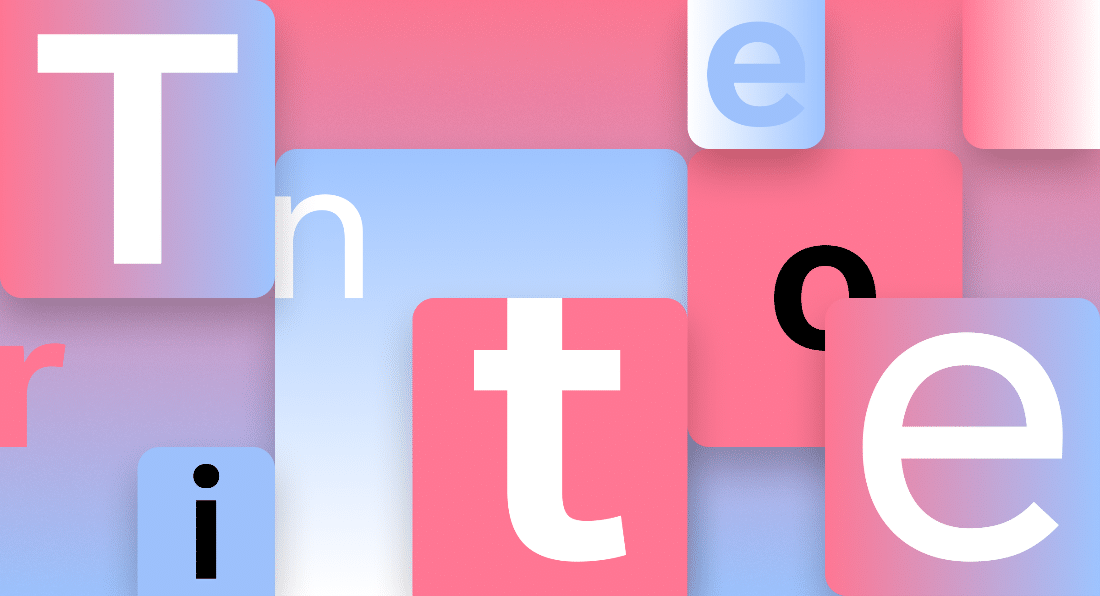
Tenorite has the overall look of a traditional workhorse sans serif (a font without a serif, or a stroke at the ends, like Times New Roman), but with a warmer, more friendly style. Elements such as large dots, accents, and punctuation make Tenorite comfortable to read at small sizes onscreen, and crisp-looking shapes and wide characters create a generally open feeling.
BIERSTADT

Bierstadt is a precise, contemporary sans serif typeface inspired by mid-20th-century Swiss typography. A versatile typeface that expresses simplicity and rationality in a highly readable form, Bierstadt is also notably clear-cut with stroke endings that emphasize order and restraint.
SKEENA

Skeena is a “humanist” sans serif based on the shapes of traditional serif text typefaces. Its strokes are modulated, with a noticeable contrast between thick and thin and a distinctive slice applied to the ends of many of the strokes. Skeena is ideal for body text in long documents, as well as in shorter passages often found in presentations, brochures, tables, and reports.
SEAFORD
Seaford is a sans serif typeface that is rooted in the design of old-style serif text typefaces and evokes their comfortable familiarity. Its gently organic and asymmetric forms help reading by emphasizing the differences between letters, thus creating more recognizable word shapes.
GRANDVIEW

Grandview is a sans serif typeface derived from classic German road and railway signage, which was designed to be legible at a distance and under poor conditions. Grandview is designed for use in body text but retains the same qualities of high legibility, with subtle adjustments made for long-form reading.
Microsoft said it would be evaluating the new five fonts over the next few months. All these fonts are now available via the cloud across Microsoft 365 apps and experiences.
Users can start trying the new fonts and inform Microsoft about their favorite font on the company’s Twitter page.
The most popular font will eventually be selected as the next default font. As for the remaining new fonts, they will be available in the font menu, alongside Calibri and other fonts in Office apps in Microsoft 365 and beyond.
We can expect the changes to hopefully take place by next year.