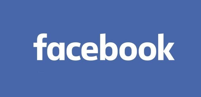
Facebook’s logo was quietly altered to make it more friendly and amicable.
Take a look at the brand new Facebook logo! Well, it’s generally new. The blue color and letters “k” and “f” is absolutely the same. In fact the new thing about this logo is the nagging sense of something being not quite right when you look at it.
Facebook just made a slight modification to its logo, which was initially designed in the year 2005, according to Brand New – a blog that covers redesigns of brands and products.
The text in the new logo is a bit slimmer and sleeker than that of the older logo, which features letters that are thicker and more block-shaped. The difference is most visible when you look at the way the letter “a” is written.
Say hello to the new Facebook logo pic.twitter.com/ofoFm4JQmK
— Christophe Tauziet (@ChrisTauziet) June 30, 2015
Facebook’s creative director, Josh Higgins, told Brand New that the company set out to “modernize” Facebook’s logo and make it feel “more friendly and sociable” and settled on an update instead of a full redesign.

Josh Higgins said to Brand New that “We developed a custom font for this logo to reflect where we are now and where we are headed. Facebook 10 years ago is very different from Facebook now.”
Facebook asked Eric Olson, the designer of Klavika, the font used for the original wordmark, to design a new style. Ben Barry, a previous designer at Facebook, had also proposed tweaks to the Facebook wordmark in the year 2012 which were approved by the company but never implemented.
The company apparently feels these changes are significant and, like Apple’s phone and desktop implementation of its new “San Francisco” font, they are clearly meant for maximum clarity and readability no matter the size of the screen you’re looking at. Since we can soon expect to see the Facebook logo in everything from VR to telepathic mind messages, a bit of simplifying is possibly a sound idea.
Still, it’s hard not to be a bit disappointed when a company gives up a tad of its peculiarity and personality for the sake of ubiquity and practicality. Where would Google’s iconic logo be now if they had decided the slim lettering, white background and two very different “g”s was an obstacle to readability?
