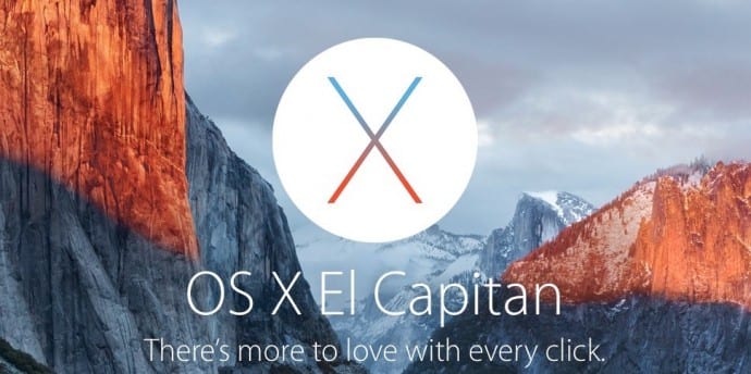
Apple tweaks CSS code on its website so that ‘Click’ doesnt look like ‘Dick’
If you had visited Apple’s website for Mac OS X El Capitan before today, you would have noticed the tagline for its new desktop operating system El Capitan “There’s more to love with every click”sentence looked more like ‘dick’ giving it a whole new meaning.
In fact, you could make it out as click only after giving it real good attention. This had caused both Apple and the website to be butt of jokes online. Eventually, the news must have reached Apple as it has now tweaked in the Website’s CSS code just to clear the air that it meant click not dick.
Apple wrapped a span around the word “click” to apply more generous letter spacing, so it doesn’t look like “dick.” pic.twitter.com/oiVj3KV5xJ
— Dan Leech (@bathtype) February 23, 2016
Apple added a little extra spacing between each letter in the word “click”, it’s a lot less likely to be mistaken for “dick”.
Good it did that otherwise, “Upgrade Now” would have taken on a whole different meaning.

