Get to know when and how you are likely to die with this interactive graph
It is always more fascinating to know the statistics of death, as it can provide some exciting awareness into genetics, diet, health, medicine, and many other social factors.
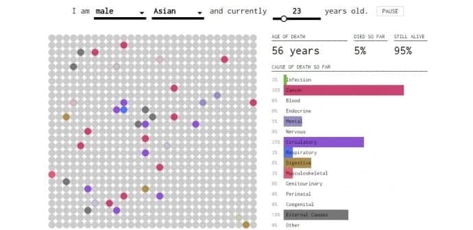
The brains behind the Flowing Data website, Nathan Yau has created an interactive graphic that envisions how and when you are most likely to die. The statistics was collected by Yau from the Centers for Disease Control and Prevention’s database that looked into the primary causes of death in the United States between 1999 and 2014.
As Yau clarifies on the Flowing Data site:
“Enter your sex, race, and age. Each dot represents one of your simulated lives, and as each year passes, more of your simulated selves pass away. Color corresponds to cause of death, and the bars on the right keep track of the cumulative percentages. By the end, you’re left with the chances that you will die of each cause.”
To get more details on Yau’s insights, click here.

